Florence Nightingale is best remembered for her life-saving sanitation reforms at nursing and battlefield hospitals. But she owed her success to her astute use of data as much as to soap.
In fact, Nightingale's numbers undercut the 1858 declaration of London's Chief Medical Officer of Health, John Simon, that death from infectious disease was "practically unavoidable." Nightingale knew that wasn't true. She had collected large amounts of data on patient mortality throughout the Crimean War in the 1850s. It was clear that, before her arrival and implementation of sanitary measures, more soldiers died from infectious diseases like typhoid and dysentery than from battlefield wounds. After sanitation was introduced, deaths from contagion dropped dramatically. This convinced her that large-scale medical reform was needed, as were formal nursing schools. But she also knew that the tables of data she collected during the war would not make the necessary impact on Great Britain's government.
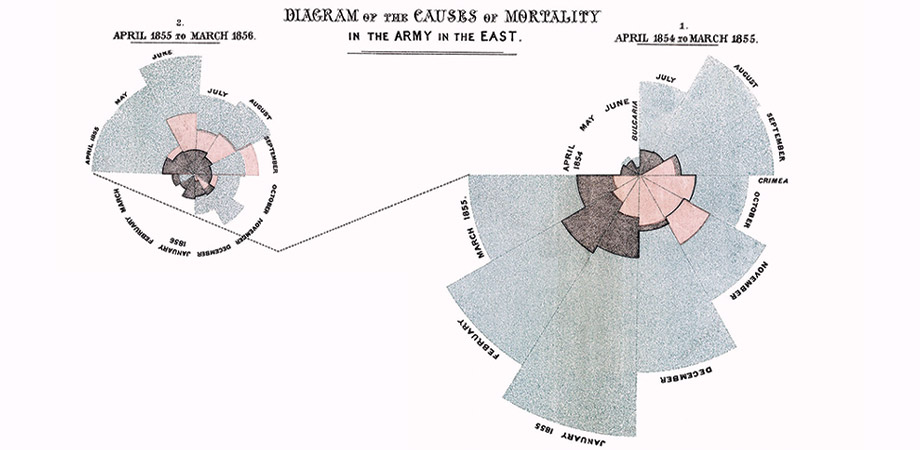
Before presenting her data to the press and politicians, she had to give the data value. In a letter to a friend, Nightingale said, "None but scientific men even look into the appendices of a report." So, Nightingale chose to communicate through data visualizations—lots and lots of infographics. She even invented a new type of diagram in 1859, now known as the comparative polar-area diagram, in which she illustrated the dramatic reduction in soldier deaths after implementation of sanitary measures at Turkey's Scutari field hospital. Her chart was widely recognized as an unsubtle rebuttal to Simon's grim assessment.
Nightingale's approach had veracity. Her infographics and illustrations resulted in new health laws, hospitals, and training facilities in Great Britain, and they are the foundation of many principles of modern medicine.
Although numerical data of the mid-19th century was small-scale compared to the terabytes of data scientists work with today, Nightingale recognized the same "Five Vs" of Big Data that we do now:
Volume: To draw meaning, there must be lots of data
Velocity: Data comes in quickly
Variety: Data is messy and arrives in many different types and formats
Value: Data's use must be discovered and put to work
Veracity: Data must be trustworthy.
In an 1857 letter to a friend, Nightingale wrote, "Whenever I am infuriated, I revenge myself with a new diagram." Data visualizations were her preferred method to harness and translate data and tell an important story.
Today's scientists use data in a similar way: They deploy vast datasets to train machine-learning algorithms that will, for example, reveal important patterns for medical diagnoses, exoplanet discovery, and even novel lens designs. In this issue of Photonics Focus we tip our hat to the world of Big Data, and the increasing role of photonics to filter, organize, and give that data meaning.
While I believe that today's data scientists are driven by a more measured objectivity than Nightingale's famously righteous fury, their work certainly shapes the stories that today's scientists, engineers, and medical doctors aim to tell.
Gwen Weerts, Photonics Focus Editor-In-Chief


